What the hell is t-SNE?
The other day I presented a t-SNE plot to a software engineer. “But what is it”, I was asked. Good question, I thought to myself.
Introduction
t-distributed Stochastic Neighbor Embedding (t-SNE) is a technique of dimensionality reduction. Data that has more than 3 dimensions is extremely common but is impossible to visualise. t-SNE is often used to reduce the data to 2 or 3 dimensions to produce beautiful plots like this:
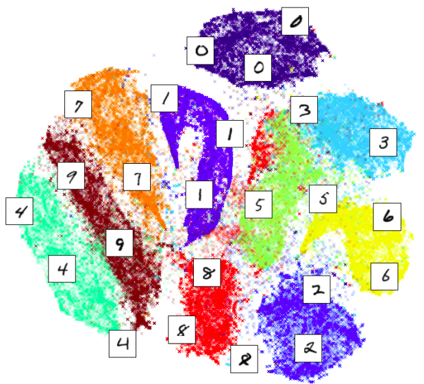
Above t-SNE was used to visualise MNIST dataset which consists of single digits like this:
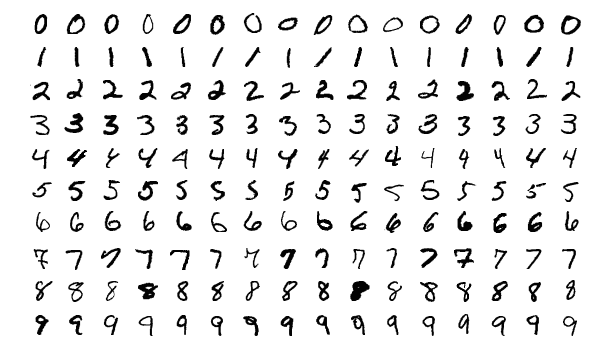
As we can see t-SNE correctly detected structure in the data and clustered points correspondingly. But how?
Watch me build something like t-SNE from scratch
I am not intending to re-build the entire algorithm here. Firstly, it’s been done by before by another blogger who loves this shit. Secondly, I found sklearn’s implementation self-explanatory for a motivated reader. I’d like to explain t-SNE for someone who is not that motivated. So let’s build something like t-SNE but not quite.
First, for each pair of points, \( i, j \), in our dataset, convert the Euclidian distance between them into a conditional Gaussian probability. This means for each sample we concentrate most of the mass on its nearest neighbours.
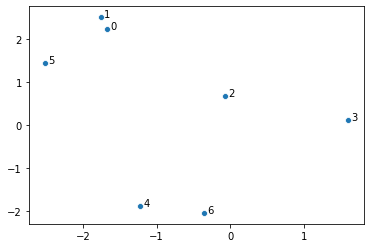
\[p_{j|i} = \frac{\exp \left ( - || x_i - x_j || ^2 \right ) }{\sum_{k \neq i} \exp \left ( - || x_i - x_k || ^2 \right )} \hspace{2em} (1)\]For example, let’s start with generating 7 random points in 2 dimensions. This is our data. In practice the data is typically multidimensional, but it’s better to illustrate the intuition behind t-SNE using this simple example.
CODE
import numpy as np
import seaborn as sns

seed = 5
np.random.seed(seed)
points = np.random.uniform(low=-3, high=3, size=(7, 2))

def make_scatter(X, ax=None):
    offset = (X[:, 0].max() - X[:, 0].min()) / 100
    ax = sns.scatterplot(X[:, 0], X[:, 1], ax=ax)
    for i in range(len(X)):
        ax.text(X[i, 0] + offset, X[i, 1], str(i))
    return ax

make_scatter(points)
Next, we compute the conditional probabilities:
CODE
import pandas as pd
from scipy.spatial.distance import pdist, squareform
MACHINE_EPSILON = np.finfo(np.double).eps

def compute_distances(points, transform=lambda x: np.exp(-x**2)):
    distances = squareform(pdist(points))
    return transform(distances)

def compute_probabilities(points, transform=lambda x: np.exp(-x**2)):
    eye = np.eye(len(points), dtype=bool)
    distances_t = compute_distances(points, transform)
    distances_t[eye] = 0.0
    distances_t /= distances_t.sum(axis=0)
    distances_t[~eye] = np.maximum(distances_t[~eye], MACHINE_EPSILON)
    return distances_t

x1 = np.around(compute_probabilities(points),  decimals=4)
pd.DataFrame(x1,
             columns=[f"p_{ {j|{i}}}" for i in range(len(points))],
             index=pd.RangeIndex(len(points), name='j'))
| j | p_{j|0} | p_{j|1} | p_{j|2} | p_{j|3} | p_{j|4} | p_{j|5} | p_{j|6} |
|---|---|---|---|---|---|---|---|
| 0 | 0 | 0.8373 | 0.1219 | 0 | 0 | 0.5947 | 0 |
| 1 | 0.774 | 0 | 0.034 | 0 | 0 | 0.402 | 0 |
| 2 | 0.0059 | 0.0018 | 0 | 0.9952 | 0.0009 | 0.0032 | 0.0012 |
| 3 | 0 | 0 | 0.8022 | 0 | 0 | 0 | 0.0005 |
| 4 | 0 | 0 | 0.0072 | 0.0002 | 0 | 0 | 0.9983 |
| 5 | 0.2201 | 0.161 | 0.0248 | 0 | 0 | 0 | 0 |
| 6 | 0 | 0 | 0.0099 | 0.0046 | 0.9991 | 0 | 0 |
Above, each column adds up to 1, meaning for each point we have a probability
distribution. As expected, points that are closest receive significantly more
weight than points that are further away, e.g. point 0 is close to 1 and
the \( p_{1|0} \) value is 77.4%.
Now, to find a t-SNE-like representation of our points, we are going to try to find new 7 points, but instead of using a Gaussian density, we will use Student’s t-distribution with 1 degree of freedom (also known as Cauchy). So the challenge is to find new 7 points, \(y_{\cdot}\), such that their transformed Euclidean distances, \(q_{j|i}\),
\[q_{j|i} = \frac{ \left ( 1 + || y_i - y_j || ^2 \right ) ^ {-1} }{\sum_{k \neq l} \left ( 1 + || y_k - y_l || ^2 \right ) ^ {-1} }\]are very close to \(p_{j|i}\). Let’s just do it by brute-forcing1. I’ll start
with exact same data-points but iteratively adjust their positions until the
matrix of q’s is close to the matrix of p’s. A process that I visualised in
the video below:
CODE
from scipy.optimize import minimize

def make_loss(target_points, itermediate=None):
    accumulate = itermediate if itermediate is not None else None

    distances_eucledian = compute_probabilities(target_points)

    def loss(points_raveled):
        if accumulate is not None:
            accumulate.append(points_raveled)

        points = np.reshape(points_raveled, (-1, 2))
        distances = compute_probabilities(
                        points, transform=lambda x: 1/(1 + x**2))
        return np.sum((distances - distances_eucledian)**2)
    return loss

accumulate = []
loss = make_loss(points, itermediate=accumulate)
res = minimize(loss, points.ravel(), tol=1e-6)

new_points = np.reshape(res.x, (-1, 2))
Let’s compare the new points to the original points:
CODE
import matplotlib.pyplot as plt

fig = plt.figure(figsize=(14, 5))
ax1 = fig.add_subplot(121)
make_scatter(points, ax=ax1)
ax2 = fig.add_subplot(122)
make_scatter(new_points, ax=ax2)
ax1.set_title('original points')
ax2.set_title('new points, minimising |P-Q|')
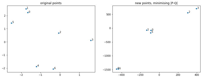
We see that points that were close together got even closer and points that were far apart got spread out. This is the underlying idea behind t-SNE: to warp the space in this manner. This happened because the tail of the t-distribution is much heavier than the tail of the Gaussian distribution:
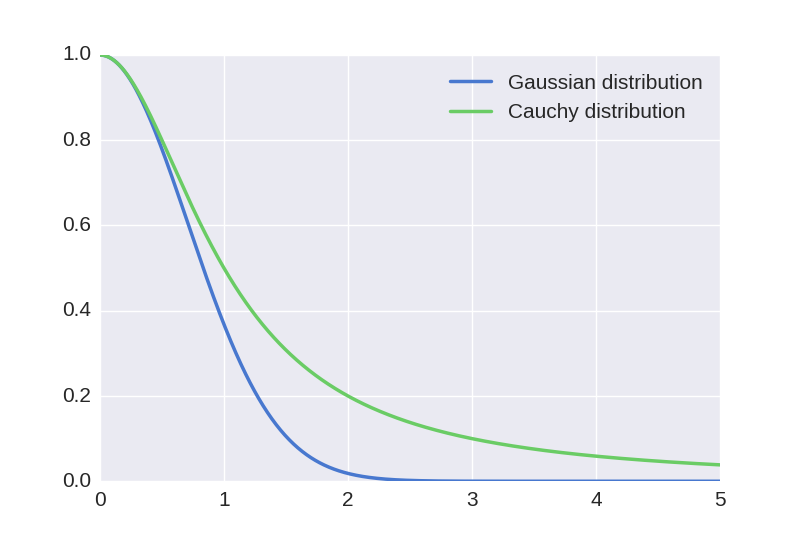
This means that we have to push distant points further away and pull close points closer for our new probabilities to match the original probabilities. The motivation behind applying such transformation is to address the so-called “crowding problem”. If we were to distribute points uniformly at random on a hypersphere with many dimensions, most points would end up close to the edges. This is because the proportion of volume close to the edges rapidly approaches one as we increase the number of dimensions:
\[\frac{r^{d} - (r-1)^{d}}{r^d} \xrightarrow[d \to \infty]{} 1,\]where \(r^d\) is the volume of a hypersphere and \(r^d - (r-1)^d\) is the volume of the crust of the hypersphere.
The above limit means if we projected linearly we’d see points crowded around the edges of a circle. With warping we pull some of those closer to the center and push many points far way from the origin.
Conclusion
If you have made this far, hopefully you have a better understanding of how t-SNE works. Well, at least I do. Now I am going to go over details that I glossed over, but briefly.
t-SNE actually deals with joint probabilities, defined as
\[p_{ij} = \frac{p_{i|j} + p_{j|i}}{2N},\]where \(N\) is the size of the dataset. Division by \(2N\) simply makes sure probabilities add up to 1. This makes the algorithm more robust to outliers. Note that joint probabilities are symmetric. When looking for \(q_{ij}\) Kullback-Leibler divergence is used, as it’s the information-theoretic way of defining how similar two distributions are one to another. In equation (1) I used Gaussian distribution with variance 2. However, in real t-SNE variance is estimated for each point using perplexity parameter, defined as 2 raised to the power of Shannon’s entropy. The perplexity is constant for each point: this way the variance is determined by the density of the region around each point. Finally, when \(q\)’s are searched for, a gradient descent with momentum is used.
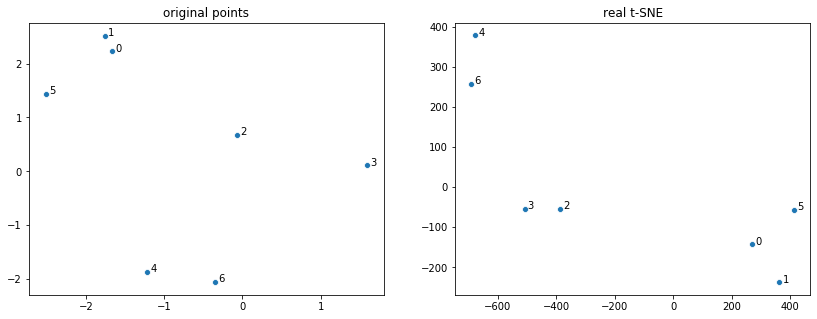
To complete the post, I am including real t-SNE applied to the 7 datapoints:
CODE
from sklearn.manifold import TSNE

fig = plt.figure(figsize=(14, 5))
ax1 = fig.add_subplot(121)
make_scatter(points, ax=ax1)
ax2 = fig.add_subplot(122)
make_scatter(
    TSNE(perplexity=2,
         method='exact',
         random_state=seed).fit_transform(points), ax=ax2)
ax1.set_title('original points')
ax2.set_title('real t-SNE')
See more:
Appendix
Animation code can be found here:
CODE
from matplotlib import animation
from IPython.display import HTML

def find_lims(accumulate):
    x_min = 0
    x_max = 0
    y_min = 0
    y_max = 0

    for frame_points in accumulate:
        reshaped = frame_points.reshape(-1, 2)
        x = reshaped[:, 0]
        y = reshaped[:, 1]
        curr_xmin = x.min()
        curr_xmax = x.max()
        curr_ymin = y.min()
        curr_ymax = y.max()

        if curr_xmin < x_min:
            x_min = curr_xmin

        if curr_xmax > x_max:
            x_max = curr_xmax

        if curr_ymin < y_min:
            y_min = curr_ymin

        if curr_ymax > y_max:
            y_max = curr_ymax

    return (np.array([x_min, x_max]), np.array([y_min, y_max]))

def animate(accumulate, frames=1000):
    step = int(len(accumulate) / frames)

    fig, ax = plt.subplots()
    scatter = ax.scatter([], [])
    lims = find_lims(accumulate)
    ax.set_xlim(lims[0] * 1.05)
    ax.set_ylim(lims[1] * 1.05)


    # initialization function: plot the background of each frame
    def init():
        scatter.set_offsets(np.array([[], []]).T)
        return (scatter,)

    def animate(i):
        j = i * step
        scatter.set_offsets(accumulate[j].reshape(-1, 2))
        return (scatter,)

    anim = animation.FuncAnimation(fig, animate, init_func=init,
                                   frames=frames, interval=10, blit=True)
    return anim

HTML(animate(accumulate).to_html5_video())
-
scipy.optimize.minimizeuses Broyden–Fletcher–Goldfarb–Shanno algorithm, which tries to approximate gradient and the second derivative: so it’s not quite brute force. ↩