Notes on Jeremy Howard's videos
This weekend I got round watching lessons 4 and 5 of the “Introduction to Machine Learning for Coders” course by fast.ai lead by Jeremy Howard and was impressed to the point of breaking my 478 days long writer’s block.
After having worked on the problem of fitting and interpreting Random Forests for almost 2 years it’s really interesting to see another experienced data scientist revealing his “bag of tricks”.
In this blog post I will write what I learned from the videos.
“Trick” 1: Spearman rank-order correlation hierarchical clustering of features
Using the code below
from scipy.cluster import hierarchy as hc
corr = np.round(scipy.stats.spearmanr(df_keep).correlation, 4)
corr_condensed = hc.distance.squareform(1-corr)
z = hc.linkage(corr_condensed, method='average')
fig = plt.figure(figsize=(16,10))
dendrogram = hc.dendrogram(z, labels=df_keep.columns,
                           orientation='left', leaf_font_size=16)
plt.show()
One can produce the following graph to examine which features are the most correlated:
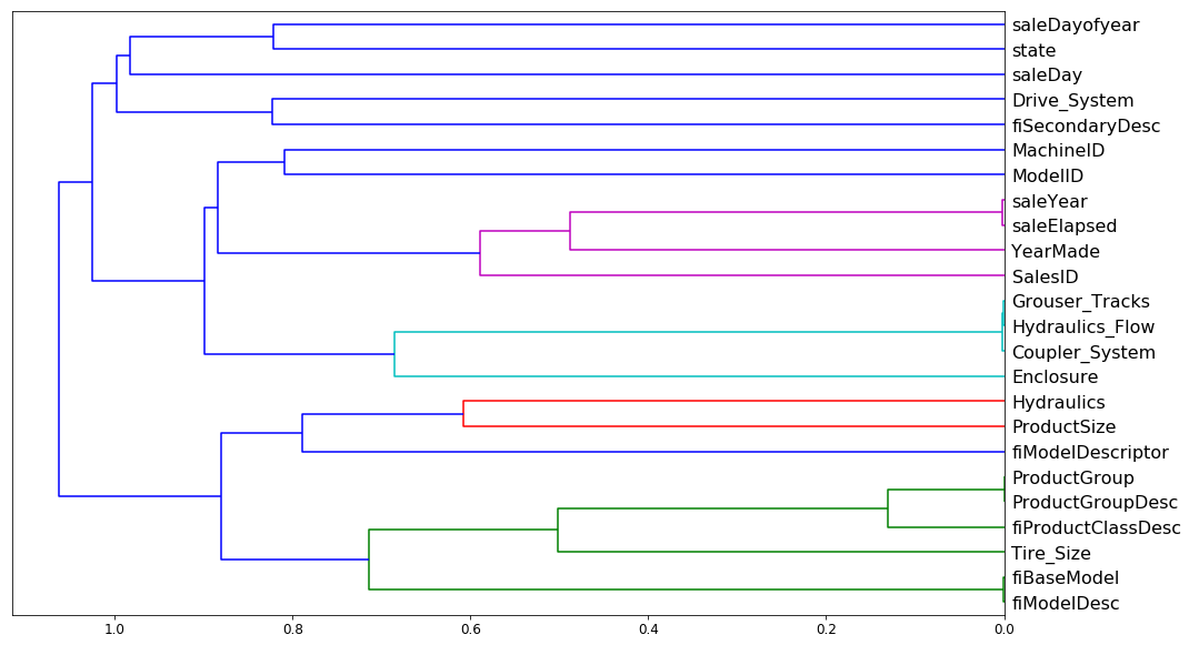
There are two new things for me:
- Instead of looking at Pearson correlation coefficient we look at Spearman’s rank correlation, i.e. Pearson correlation between the rank values of those two variables. This helps with comparing variables that are on different scales.
-
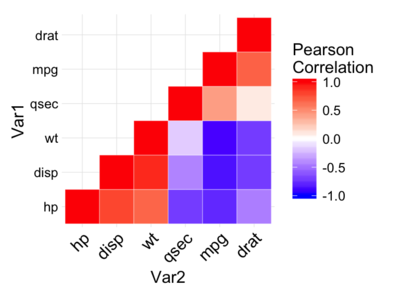
Instead of drawing a typical heatmap (example below), hierarchical clustering is used:
In hierarchical or agglomerated clustering, we look at every pair of objects and say which two objects are the closest. We then take the closest pair, delete them, and replace them with the midpoint of the two. Then repeat that again and again.
The resulting plot looks more informative and easier to read than a simple
heatmap: variables that are joined together later are most correlated (e.g.
SaleYear and SaleElapsed are very correlated whilst SaleYear and
TireSize are not correlated).
“Trick” 2: PDPbox
When sanity checking a trained model it’s common to ask what the effect of
varying a particular feature is. For example, time since registration is
typically a significant feature in detecting fraudulent accounts: newly
registered accounts are more risky. Thus you would hope that holding everything
else constant whilst reducing the value of timeSinceRegistered should yield
higher prediction probabilities of an account being fraudulent. Turns out
there’s a library that does just that. Using PDPbox one can make so-called
Individual Conditional Expectation (ICE) plots:
def plot_pdp(feat, clusters=None, feat_name=None):
    feat_name = feat_name or feat
    p = pdp.pdp_isolate(m, x, feat)
    return pdp.pdp_plot(p, feat_name, plot_lines=True,
                        cluster=clusters is not None,
                        n_cluster_centers=clusters)
plot_pdp('YearMade')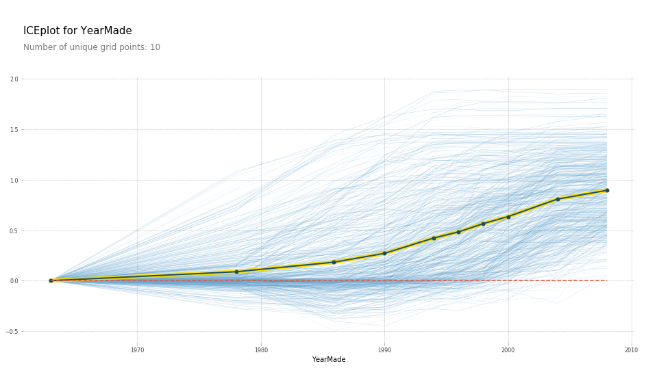
here each line represents a row in the dataset and the yellow line is the mean prediction.
We see that with YearMade increasing the predictions tend to increase. Since
they are too many rows drawn on the plot, we can cluster rows and see that they
are distinct patterns of how the target increases:
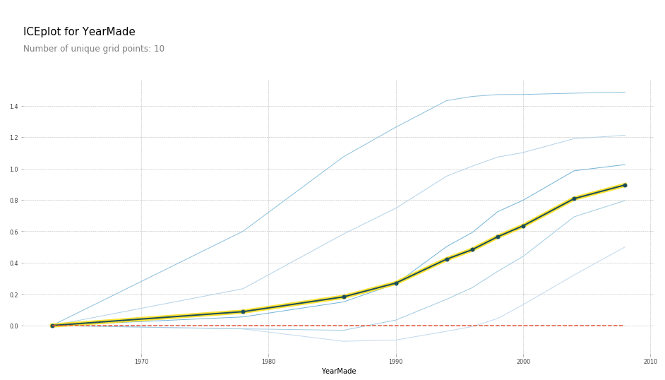
What’s new for me:
- I have witnessed a colleague of mine computing ICE values in his jupyter notebook but didn’t know that a library that does just that exists!
- The idea of clustering rows according to how they vary when input is varied is new to me. Perhaps one could further drill down into each cluster and see why that’s the case.
“Trick” 3: treeinterpreter
Looks like Jeremy is a fan of Saabas’ treeinterpreter
library that allows one to compute feature contributions behind every
prediction and he goes into explantation of how the method work in his lessons.
However I have always been sceptical of the method: although my scepticism is
only intuitive. Regardless treeinterpreter wasn’t production-ready in 2016:
it was simply too slow for computing contributions in a live system. This
resulted in me inventing a different method that is more like
permutation method but applied to a single row. The method, also known
as leaveoneout, turned out to work quite well in practice: it is fast and has
been incredibly useful in pointing out leaky features (since those contribute
the most).
Fast-forward to 2019 though and I have stumbled upon shap library. Its author, Scott M. Lundberg, showed in this paper that Saabas’ method is inconsistent:
This means that when a model is changed such that a feature has a higher impact on the model’s output, (inconsistent) methods can actually lower the importance of that feature.
I suspect that leaveoneout is also inconsistent and thus should be abandoned
in favor of SHAP values proposed by Scott. In addition, SHAP library is
production-ready as the library is very fast. SHAP feature importances are
backed up by Shapley value solution from game theory and thus have a bunch of
nice properties as a result.
Kudos to Jeremy for not even mentioning the .feature_importances_
attribute of Random Forests. Carolin Strobl has shown those to be rubbish.
What’s new for me:
- Nothing :). I wrote to Jeremy to consider educating about SHAP values instead of promoting treeinterpreter and he replied.
“Trick” 4: Detecting data-leakage and feature drifts.
Oftentimes predictions on the validation set look radically different to the
predictions on the training set. For example I once dealt with a situation when
the model scored everyone in the validation set as fraudulent despite the
proportion of fraudsters in the training set being only 1-2%. Such things happen
when train and validation set are radically different and is
especially common when validation set is more recent than the training set. One
reason for a discrepancy could be feature drifts: recent data is simply
different to training data. Another reason for such disparity is data
leakage. Most common source of data leakage in my practice is using data from
the future when extracting features. For example, the inclusion of
lifetime_duration_of_a_customer feature when predicting probability of churn.
For newly registered customers the value of such feature is unkown and thus the
model won’t generalise to most recent customers. So how do we detect that
the validation set is different from the training set and, most importantly,
figure out why it is different?
One idea that I came up with was to examine the predictions paths of decision
trees. Perhaps validation set ends up in leaf1 10% of the time whilst
training set hits leaf1 only 5% of the time. The resulting software package,
which I named NodeProp points out feature drifts quite well but has many
false positives: I get the impression that my algorithm still needs some
tweaking for it to be more robust. Unfortunately I no longer have access to the
source code and thus can’t tweak it.
How does Jeremy deal with this issue?
He creates a new target variable is_validation_set and sets to True for
validation and False for training subsets. Then he trains a random forest and
examines which features are the most important. Ideally one shouldn’t be able
to predict what is in the validation set and what is the training set. However
if it is possible, it is crucial to examine which features allow such
prediction. I find this technique to be ingeniously simple!
“Trick” 5: Make sure your validation set generalises to production.
Imagine the blissful moment when, after all the data extraction and preprocessing, you finally have all the data prepared and ready for modelling - and you start playing around with various models, features and hyperparameters. But wait, you are still having doubts whether any of this work will generalise to production. After all, what works offline often doesn’t work once deployed, as you probably have learned from experience. How do you gain more confidence in deploying your own models? I have developed a habit of manually inspecting a few predictions before deploying anything to live: however such process1 is far from rewarding. Jeremy advocates building 5 completely different models and making sure that their performance aligns monotonically. So the top model on validation should be the top model in production. The second best on validation should be the second best in production and so on. This way one can be sure that the performance on the validation generalises well into production. One must trust their validation set to be representative before optimising the performance on it (duh!).
Conclusion.
I have thoroughly enjoyed watching just 2 lessons and I can’t wait to watch more material by Jeremy Howard. Another meta-lesson is how much of practising data science consists of learning various techniques rather than just learning how to code against API provided by sklearn. This is a reminder to myself to keep watching educational videos and keep learning from other practitioners. And I hope to blog about what I learn more often :).
P.S. special thanks to Hiromi Suenaga for her excellent notes.
-
we used to call this “babysitting” at ravelin.com. ↩